 Are you wondering why you’re not getting sales? You’re not even getting comments in your blog posts. You feel like you’re writing to a brick wall, and ready to give up. Most affiliate marketers when they first start their online business do not know how to write a call to action on a website.
Ask any successful online affiliate marketer what one of their secret ingredient is to making money and they will always tell you about the power of the calls to action (CTA). Without this there is no conversion, no sale.
![]()
The Amazing Power of the CTA
So this is you calling your targeted audience to take some kind of specified action on your website.
This powerful invitation is commonly written as a text link like ‘Sign Up Now to Get Your Free eBook’, ‘Join Today and Get Your FREE Membership!’. They can go in your action buttons, hyperlinks, banners, and product links.
Anything that will cause curiously to get your readers to click. Maybe you want them to download a PDF, or click to another page from your article.
Any successful CTAs will lead into conversions. Conversions are when your visitors have responded from a call to action.
There are thousands of different calls to action types which you can use anytime you want your visitors to do something or respond so you might want to spend a bit of time here getting familiar with them.
Common Types of CTAs
- Subscription sign-ups
- Purchase button “Add to cart”
- Social media share buttons
- Affiliate program banners / widgets
- Information gathering forms
- Live chat (help)
- “Create Your Free Account”
- “Yes! Sign Me Up”
- “Get Started Now”
- “Read More”
- “Try It Now”
Where To Place Your CTAs
You can really place them pretty well anywhere you like but the most popular places to put them are at:
- End of the article
- Purchase pages
- Footer
- Ads
- Slide-ins and popups
- Hello bars
- Side panels
What To Put In Your CTAs
The information you put into your CTA is important. The action is a specific action you want your readers to take because you are helping them with something and this action will solve it for them.
It must be irresistible and every effort must be put in as this is your last chance to get them to take action to get a conversion.
Most often readers will quickly read the first 2 paragraphs and if it is what they are looking for, they will scan down and look at the headlines and anything else that stands out and then go back up and read down.
They need to spot your CTAs effortlessly and quickly understand the action you want them to take.
The three main features of a CTA:
- Placement – Where to place them.
- Design – How it looks.
- Text – What it says
Let’s take a closer look at these features.
Placement
Your CTA is part of your article and needs to be placed where it makes the most sense.
There are 3 components to the placing of these CTAs.
1) Every post – Don’t miss your opportunity of getting your readers to take some kind of action. Even a simple action “if you have any questions or comments…” can give you a conversion and is better than leaving no action. Give them a chance to read some of your other articles. After all, isn’t this why you write to them? By the way, Google wants to see engagement with your visitors which helps in ranking your site.
2) Multiple CTAs – You can place more than one CTA in your article, increasing your chances of getting conversions. By doing this you are giving your readers more opportunities to take action at any point especially if your content happens to be lengthy.
TIP: Do not place CTAs with too many options on your article. It’s best to keep your CTA message consistent within the content and not be competing with your other articles to avoid confusion to your readers.
3) Strategically placed – Place your CTAs where you can get maximum attention, in other words, say you write about memberships in an affiliate program well you can place the action just after that. That action can be “Get your FREE starter member”.
Studies from Nielsen Norman Group have been done on how visitors go to read articles online and how they are visually focussed and it appears they scan in an F-shaped pattern.
Keep in mind, the visitor usually doesn’t have a lot of time and will read the first two paragraphs going from the left going to the right. This would be a good time to place an intriguing CTA on the side panels, either on the left or on the right side and at the end of the content.
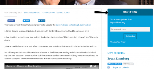
This CTA is located at the top right panel and the reader will not miss it for a couple of reasons. First, it’s very noticeable because it’s at the top and second, the reader would start reading the content starting from the left going across to the right.
Design
The design of the CTA should be eye appealing and pleasant to look at.
There are many ways to design them. You can do your own researches to see how your competitors are designing theirs to give you ideas. CTA guide creations will give you plenty of ideas to help you find what best suits your needs. There are also simple tools like Da Button Factory that give you quick and pretty call to action buttons that you can design and download.
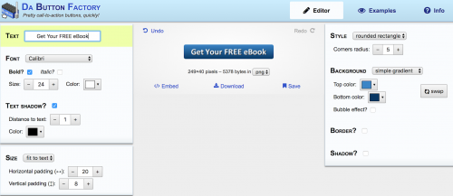
The main objective is to have a clear message that will instigate the readers to take action on your purpose, making it pretty won’t do anything.
Your CTAs should be designed to be:
Noticeable. It should be easily recognizable and by this I mean, don’t make it dizzy and complicated looking to the point where your reader finds it annoying.
Make your CTA more noticeable and apart from the main body text by using shadows and contrasting colours inside the outline to clearly define it.
Call out. Your CTA should be appear like it’s calling out to the reader. I find contrasting colours inside the outline or outside if it’s part of the text content works very well.
Appealing. The style of your typeface design such as the specific font weight, style, width and slant need to be considered. Usage and selection of colours is totally up to you. Make your outlines colourful if you like and I would suggest first looking at your site’s colour scheme, the type of audience and products you market to help you out
Images are how people relate things in their minds, and one of the best advice from successful online affiliate marketers say is to have an image of a person looking at the viewer. If you see someone holding a wad of cash in their hands, what would you be thinking? Is that a scam..can I make money..
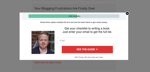
I chose this image as an example of a CTA showing the face of a man who is asking you, the reader, to click the “SEE THE GUIDE” action button. At the bottom it mentions the privacy and lets you know they never share your email. Can you trust this CTA? I think it’s a great image showing trust.
Negative space is another effective CTA. It basically means having empty space around your CTA and is, in my opinion, much more eye-catching to the reader. I find they make the message clearer, adding appeal to give them a better experience.
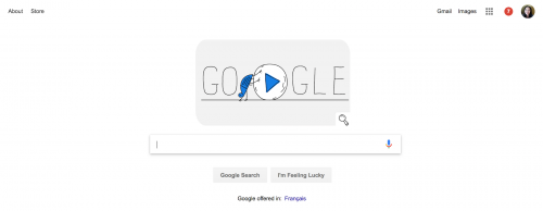
This is a great example of a CTA negative space. Google designers have made it very clear what they want the readers to do.
Clear and precise text. Your CTA text must be a clear and precise message. The reader needs to know quickly what will happen after clicking in the button. For example, if your CTA is signing up to the free starter membership, when they click thru, the readers need to know they will get their free membership. Be upfront with your offering allowing no surprises and no broken promises that will lead to site distrust.
TIP: Make sure the CTA button really works.
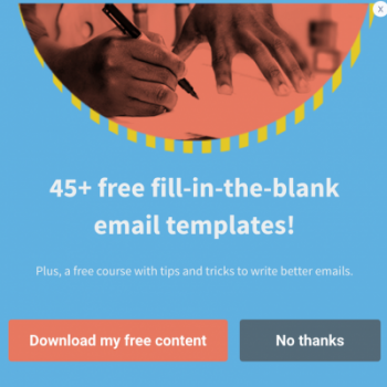
This CTA presents a clear message. You know you will be getting 45 and over free fill-in-the-blank email templates in addition to a free course with tips and tricks by clicking in their “Download my free content” button. They also let you say you don’t want it.
Use action verbs. Use meaningful and powerful short action verbs such as Buy, Subscribe, Learn, Get, and Order. Everyone likes to GET something. Who wouldn’t!
Communicate the value. Even though you may be giving the readers something FREE, they may not click thru if the value, the what’s in it for them is not clearly understood. Even if it is free, they have taken the time to read your article and made the effort to respond to your action call. They must still know it is going to be something worthwhile to them.
Who knows, down the road, they will come back and make a purchase because that free eBook was helpful information. Ask yourself why should they be buying it? Will they get 25% discount? This is how you get your readers to convert.
If you are giving a free ebook on how to lose weight. The value can be free recipes and getting to feel beautiful.
Putting the words, Buy Now, Start Now is of no importance if the readers don’t know what they’re getting.
![]()
![]()
Which do you think would be the most effect CTA? “Submit” is too general. If you picked “Get your FREE Starter Membership”, this is the best CTA because your audience will know exactly what they will be getting.
Building trust. Instilling trust is hugely important these days with online purchasing to any online businesses. Your CTA must have trust in your eCommerce business and landing pages to get conversions.
For this, you only need to use a few words. If you want your readers to subscribe to something, just add in that they can “unsubscribe anytime”.
Another good trust statement in your CTA is “No credit card is required”.
Conclusion
Remember, always put at least one CTA in your post. By doing this, you are asking your readers to take some kind of action and when they do, Google will be happy because there was engagement.
Talking about Google, do you want to know how to rank on page one in the search engines?
==> CLICK HERE: 2018 How to SEO Your Blog Post (Foolproof Checklist)!
I hope you found this helpful information. If you have any questions or comments or any other CTAs that work for you, it would be great to hear from you.
Thanks for reading,
Monica

